According to psychology, our mind works in such a way that we try to avoid risks or, if we do decide to take them, it is usually because we are feeling confident or there is a potential reward behind that decision (as learned from the book Behave: The Biology of Humans at Our Best and Worst by Sapolsky, Robert M, recommended in this article).
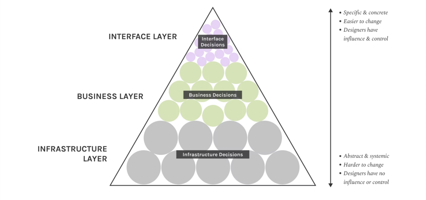
Having said that, I’d like to bring up a concept first shared by Curt Arledge, in which he describes design ethics as a layered context, with which I resonate a lot.

So, how does this pyramid relate to the levels of decision-making? Well, let’s use layers as levels to make these decisions where designers can be involved or not.
To my own interpretation, here is how I see that we can get involved and be responsible within these layers:
- The Interface
The most obvious one, where designers are in charge. It’s the level to which users interact at first and give you feedback. Also, it’s the one where we have the most decision power if our design is following responsible guidelines when we put it out in the world. - The Business
More and more I like to think of this level as the one that describes the value of a product. Here, the line becomes thin when we think of the role of Product Designers and the research we do behind taking product decisions. I believe that it’s the decisive level and as Curt mentioned it as well, “the types of decisions that get made in this layer influence the core nature of specific digital objects: what products get made, how they make money, and whom they serve (and don’t serve)”. - The Infrastructure
Last but not least, this level influences everything above through opportunities, as well as multiple constraints. Thinking of how fast technology evolved, we can only learn from the past and from examples from other mediums. Here, designers don’t have much to say, but it’s their responsibility to be masters of the medium in order to make the best design decisions.
A decision-maker is directly responsible for the work they put out into the world.
Well, stay tuned, because there are a lot of things we can do here.
In the Ethical Hierarchy of Needs, conceptualised by Aral Balkan and Laura Kalbag at Ind.ie, they did a great job at describing the core of what ethical design means.

Although we’ll describe in detail in the next articles with practical examples for each level, we need to de-brief it together first.
So what does that mean? In simple words, as designers, whatever we put out in the world needs to create positive experiences and the interfaces need to be functional for any user, safe and healthy.
To “translate” and to repeat, ethical design means, at least:

- No privacy issues. Don’t ask for more than you need. We just.. don’t want that.
- Don’t make our world busier than it is. Keep it simple. As Calm tech teaches us, “technology shouldn’t require all of our attention, just some of it and only when necessary”.
- Accesible & Inclusivity. Think at least of colour, text, keyboard accessibility and don’t limit to the web medium if you’re designing for more than that.

